需要分析

需要分析のための AI ドリブン ソリューション

さまざまなデータセットから得られるリアルタイムのインサイトと予測分析を活用し、変化する需要や市場シグナルに対応します。

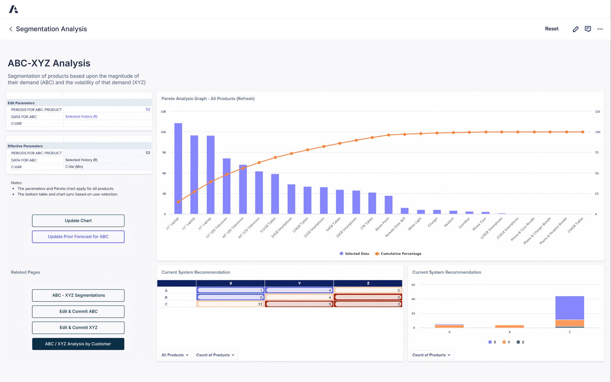
An Anaplan Segmentation Analysis dashboard titled “ABC-XYZ Analysis,” showing product segmentation based on demand magnitude (ABC) and demand volatility (XYZ). The main chart, labeled “Pareto Analysis Graph – All Products,” displays blue bars representing selected data for products such as 15” Laptop, 13” Laptop, and 55” LED Television, with an orange line indicating cumulative percentage. The left panel includes editable parameters for “Periods for ABC: 52,” “Data for ABC: Selected History (R),” and “C-VAR (Min),” along with buttons labeled “Update Chart” and “Update Prior Forecast for ABC.” Below the graph, a table labeled “Current System Recommendation” categorizes products by A, B, and C classes across X, Y, and Z variability, while a bar chart on the right visualizes product counts for each category. Additional buttons on the left include “ABC-XYZ Segmentations,” “Edit & Commit ABC,” “Edit & Commit XYZ,” and “ABC/XYZ Analysis by Customer.” The interface provides structured, interactive data visualization for accessibility

Anaplan Statistical Forecasting アプリケーション

AI と ML を活用してデータ主導の統計フォーキャストを提供する専用のアプリケーションで、サプライチェーン全体を連携します。

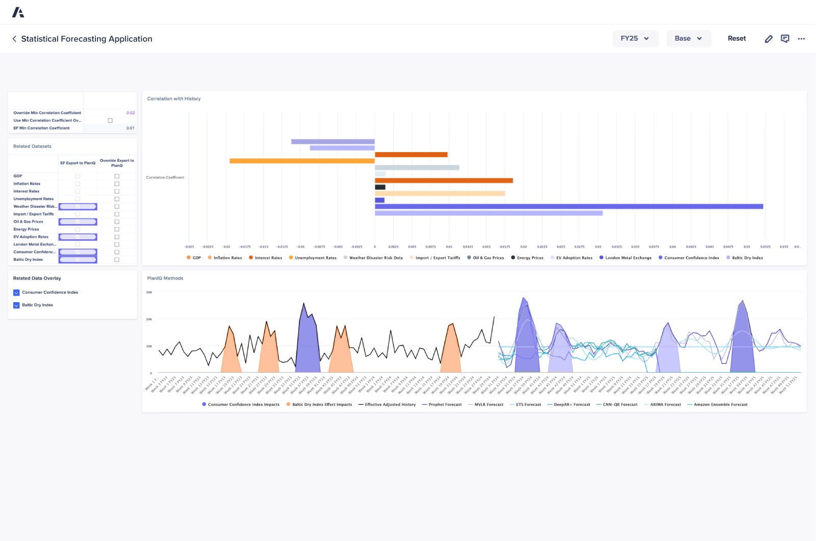
Statistical Forecasting Application dashboard displaying correlation analysis with various economic indicators and a time series chart comparing forecasting methods, including Consumer Confidence Index and Baltic Dry Index impacts.
Soft Blue to Cream Gradient Background

Anaplan を導入したことで、可視性の高い、より強固な需要モデルが構築され、結果として需要予測の精度が向上しました。


ジャスティン・モデロウ (Justin Moderow) 氏、統合ビジネス プランニング及びテクノロジー部門マネージャー、Wright Medical Technology 社

Wright Dark Blue Logo

サプライチェーン部門のリーダーが信頼するプラットフォームを実際にご覧ください。Be the next.

世界中のサプライチェーン チームが Anaplan でコネクテッド エンタープライズを構築しています。ぜひご検討ください。

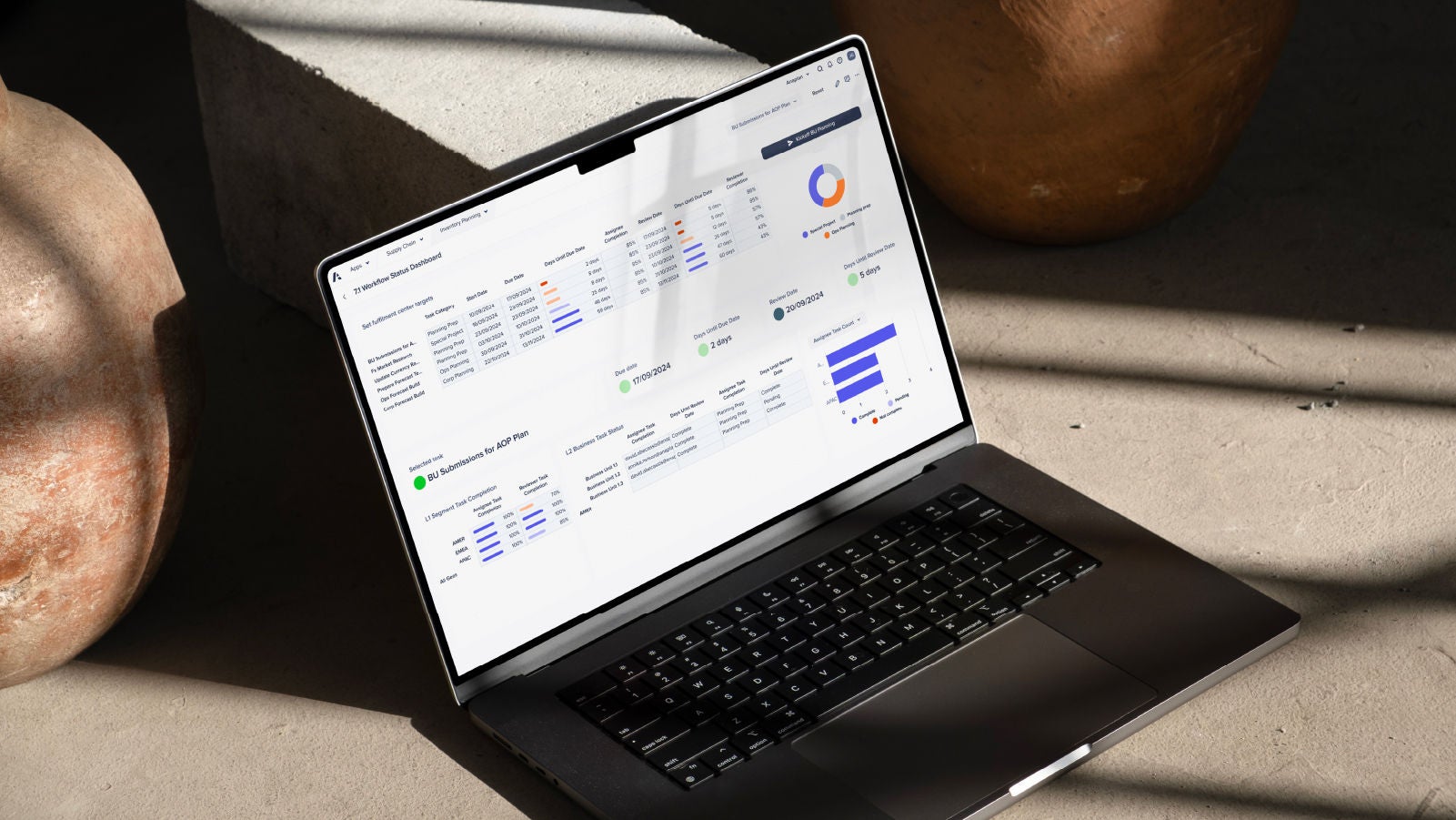
A laptop displaying a dashboard interface, positioned on a table, showcasing data and analytics.